OLIVIA RENZI DESIGNS

ABOUT
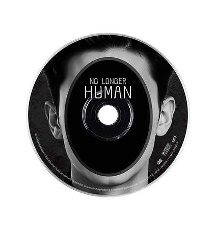
The Yozo project is a multi-layered, long-term exploration with several interconnected pieces. It began with the challenge of designing an original, functional typeface for a book that had not yet made the leap to film.
That typeface then became the backbone for the rest of the system: a DVD case and packaging concept, a hypothetical movie poster, and eventually a full title-sequence motion piece. The project grows outward like rings in a tree, each component building on the last.
SCOPE
Typeface Design
Typography
Motion Media
Packaging Design
Poster Design
TOOLS

Yozo Regular is a blocky, minimal, sans serif typeface shaped by the atmosphere of Osamu Dazai’s No Longer Human. It leans into a quiet, mechanical tone without letting go of a human pulse. Soft curves balance its rigid geometry, creating a typeface that feels both stark and alive. Its clean tension makes it a strong choice for bold, forward-leaning design work.


Movie Poster